The challenge
Designing for all
We understand that great design has the power to make waves and break down accessibility barriers. That’s why, when we were tasked with creating the first-ever logo for Row The Rhythm – Love Rowing’s inspiring new initiative to encourage people with a visual impairment to fall in love with the sport – we couldn’t wait to dive right in.
But how do you create a dynamic and inclusive logo that is just as effective for those with 20/20 vision as it is for individuals with sight loss? The answer is simple: be bold, be memorable, but above all else, focus on the audience.

Our creative process
Row with the flow

We collaborated closely with the amazing Love Rowing team to gain key insights into the initiative’s long-term objectives and the requirements of its target audience.
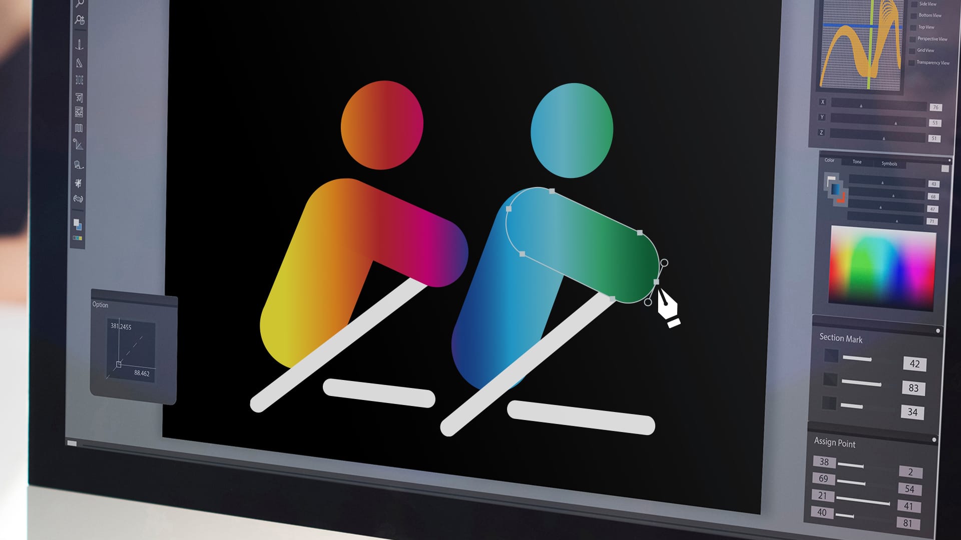
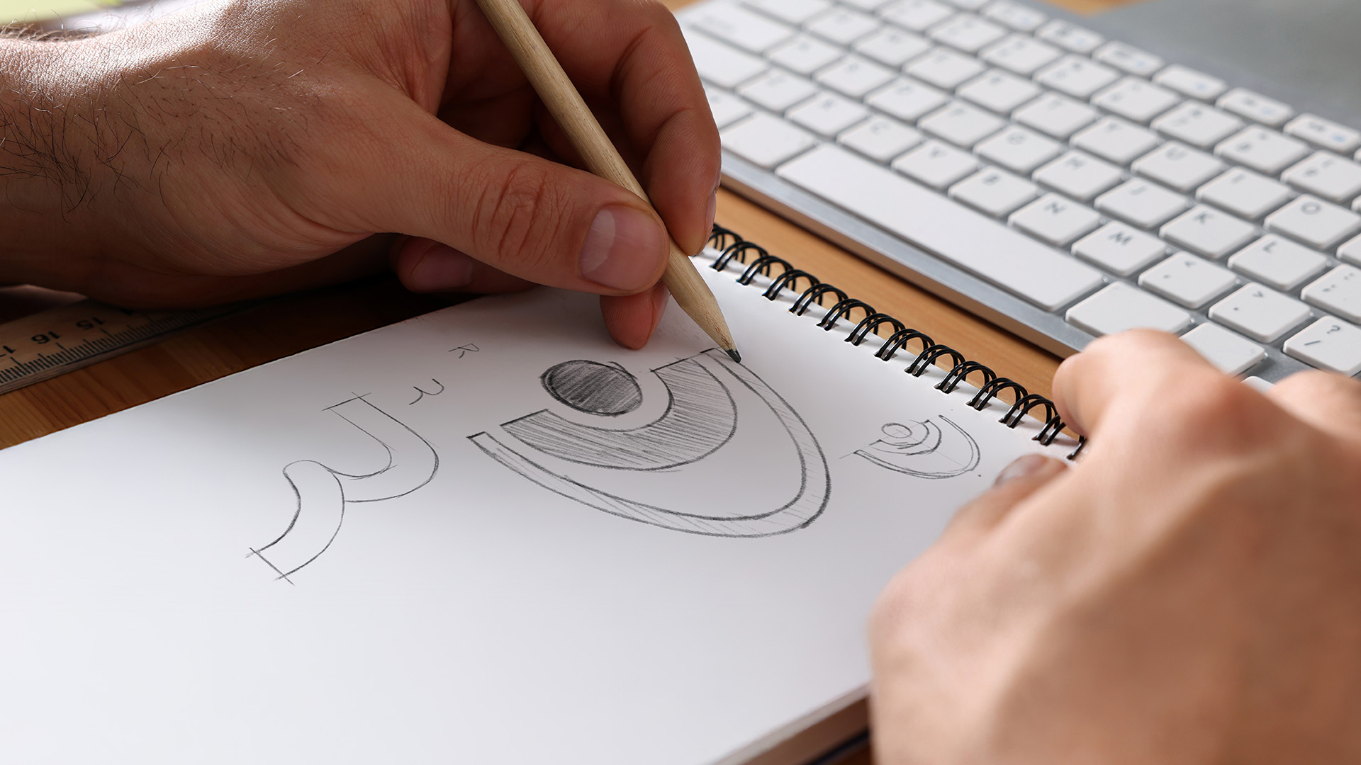
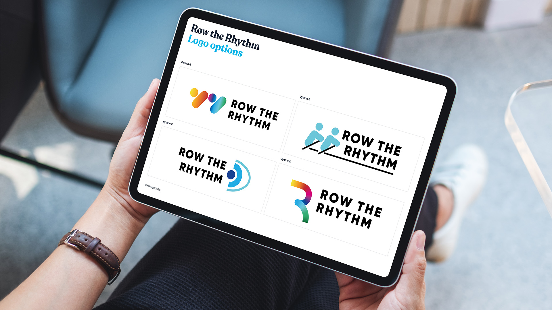
To better understand the industry, we also conducted thorough research into logos from like-minded sight-loss and rowing organisations. This helped us create a series of diverse and inclusive initial designs that were truly distinctive. These designs drew inspiration from the physical action of a rowing stroke and its effect on the water’s surface, while also incorporating the rainbow gradient and brand colours from Love Rowing’s main logo. We also included simple, immediately recognisable characters for broad appeal and inclusivity.
Once we were happy, we then invited the Love Rowing team to share our initial concepts with members of the sight-loss community to get real audience feedback. Throughout the entire design process, accessibility was at the forefront of our minds; however, we always knew this would be the real test!
Building on the invaluable feedback we received, we incorporated a black background with white text to achieve maximum contrast and adjusted the kerning and font weight for optimal legibility. From there, it was smooth sailing.
The result
A stroke of genius
The result is a dynamic design that can be embraced and appreciated by everyone, whether they are part of the sight-loss community or not. It’s practical and functional across multiple platforms, from websites and social media channels to keyrings and lanyards.
With the final logo approved and the client thrilled, we then created a comprehensive and easy-to-use logo guidelines document. This clearly outlines how to use the logo for various platforms for full effectiveness, cohesiveness, and accessibility.
With a new logo and essential design guidelines in hand, the Love Rowing team is now ready to roll it out across all outward communications and future assets.
Thank you so much team Harleys. This is brilliant!

