The challenge
Getting rebranding right
Rebranding a corporate identity can be challenging. Get it right, and perceptions of a business will be enhanced. Get it wrong, and a company’s image could be diminished. When Nammo needed to update the way it communicated while reflecting its vision and values, Harleys was on side.
Our creative process
Branding that says ‘trustworthy and professional’
We partnered with Nammo to hold brainstorming sessions and develop a refreshed brand that reflects the company’s trustworthy and professional status.
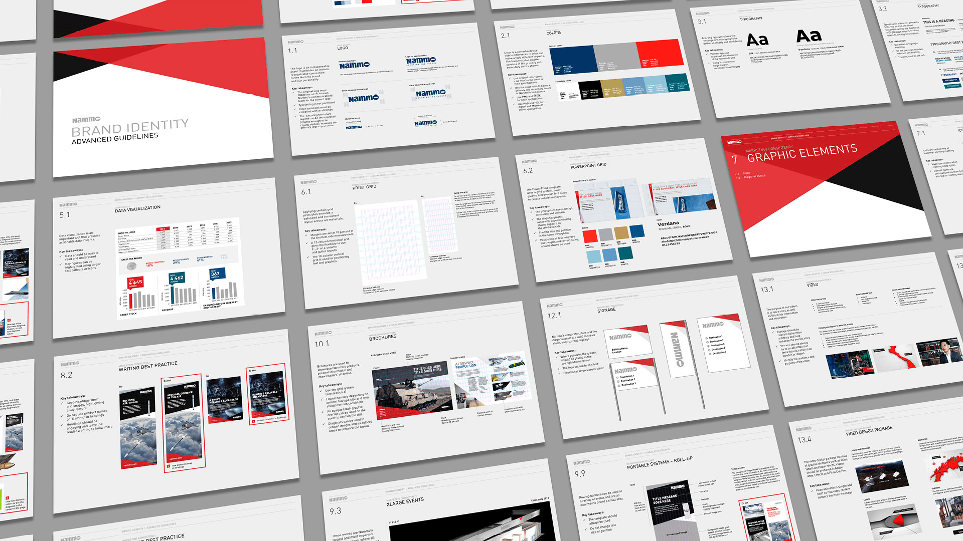
In addition, we explored what different users needed from guidelines for the updated Nammo brand. We discovered that standardised guidelines needed to be developed, covering use of the refreshed brand materials by Nammo’s marketing team as well as external agencies.
The outcome and impact
Bold, consistent, distinctive
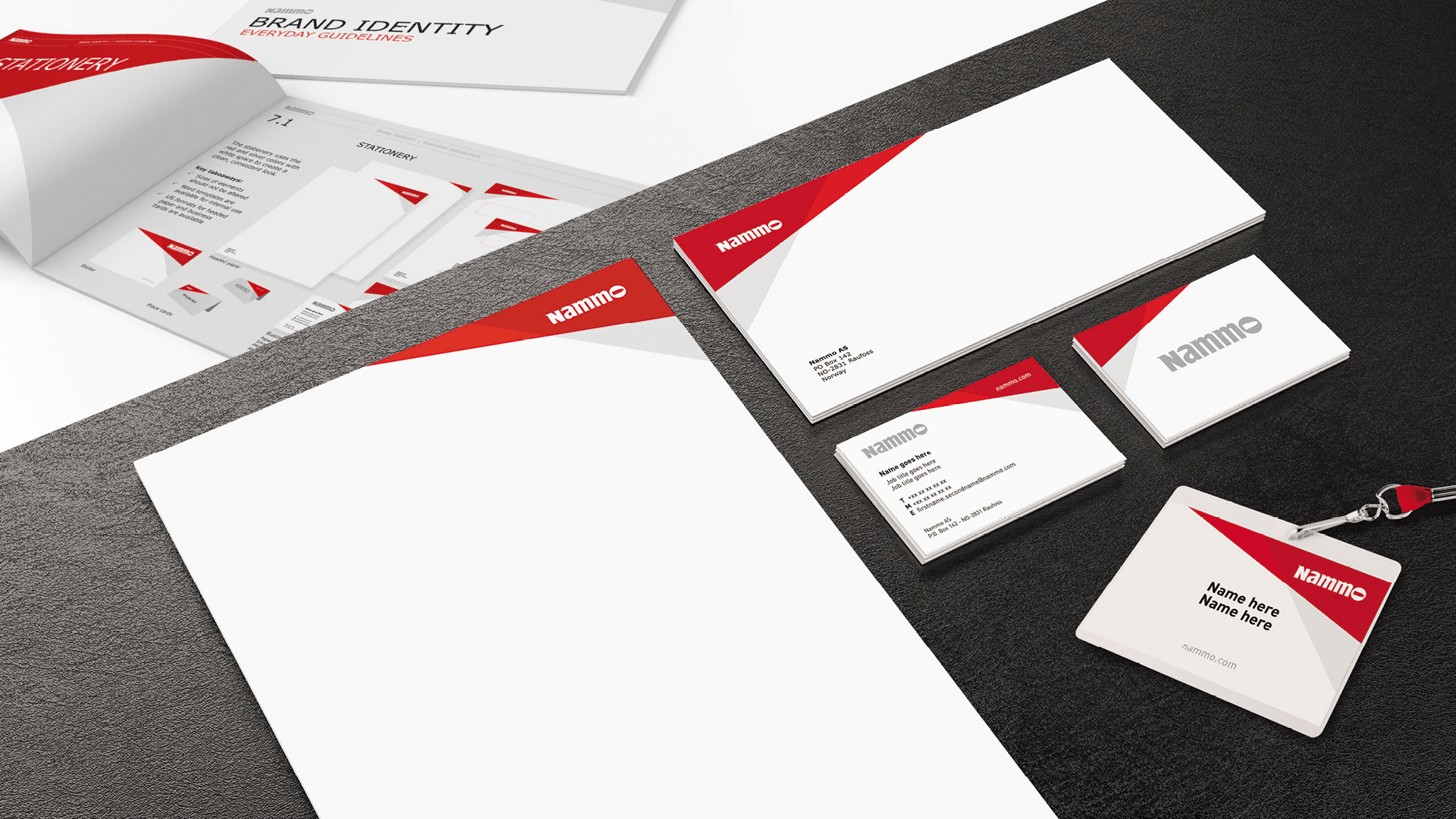
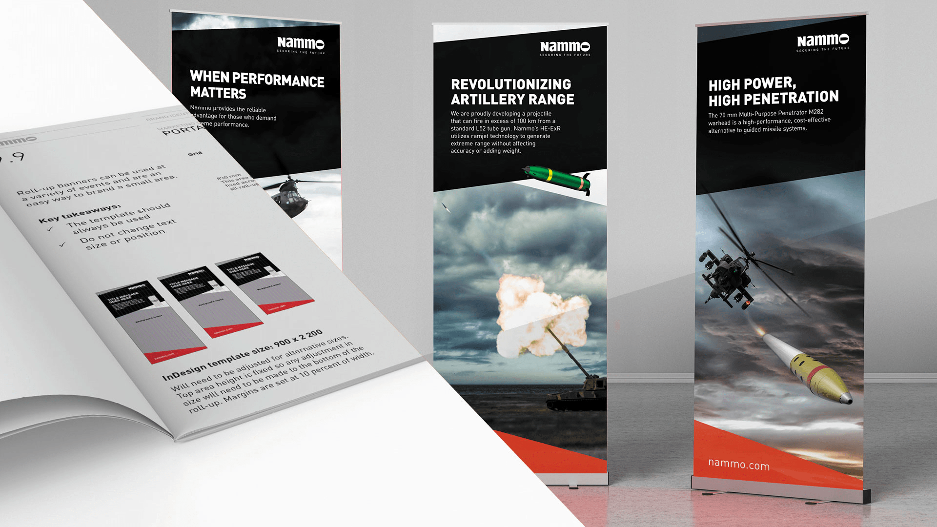
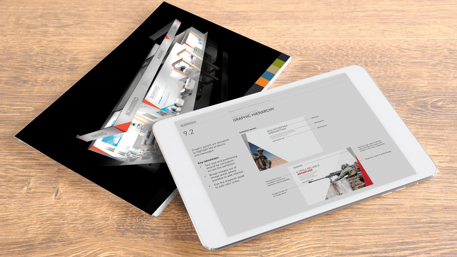
Nammo now has a bold and consistent visual style that can be applied across different mediums. It features a diagonal design concept and uses Nammo’s distinctive red, black and white colour palette.
But we didn’t stop there. We also produced an updated manual for the refreshed Nammo brand, featuring separate guidelines on both internal and external use. In addition, we created the Nammo Brand Book, a high-level document detailing the who, what and why of the Nammo brand, ensuring that everyone is on the same page when it comes to showing the world who Nammo really is.